Responsive Web Design: What It Is & Setup Tips
Written by Josh Rowe on March 24, 2023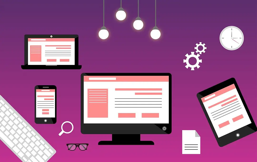
Responsive web design uses flexible layouts, images, and CSS media queries to adjust the website's appearance and functionality to fit the screen size of the user's device. It's a best practice to follow when designing a website as it allows you to create and organize pages that look great and work seamlessly on all devices, from smartphones and tablets to laptops and desktops.
If you ignore the need to design for multiple displays or use-case scenarios, you'll fall behind your competition and lose out on building relationships and new customers. Search engines will push you to the bottom below better-optimized sites, and people will have a hard time navigating your content if they do find you.
Here are some reasons why your website should be responsive:
- Improved user experience. A responsive website is easier to use on all devices, which can lead to increased user satisfaction. People are more likely to stay on a website if it's easy to use and navigate.
- Increased search engine visibility. Responsive websites are more likely to be ranked higher in search engine results pages, as Google and other search engines prefer to show websites that are optimized for mobile devices.
- Reduced development costs. Responsive design can help reduce the development costs of a website, as it eliminates the need to create separate versions of the website for different devices.
- Increased conversion rates. Responsive websites are more likely to convert visitors into customers, as they are easier to navigate and provide a better user experience.
If you're looking to create a responsive website, there are a few things you can do:
- Use a flexible layout. One of the most important aspects of responsive design is to create a flexible layout. This means that your website layout should be able to adjust to fit the screen size of the device used. There are developer tools like Chrome DevTools and third-party services available like BrowserStack that allow you to test layouts in a large selection of devices and environments.
- Use images that scale. Images should be scaled to fit the screen size of every device. This will help ensure your website looks good on all screen sizes regardless of the device type used and can be accomplished by either implementing the srcset attribute or installing a third-party plugin if you're building your website in a content management system.
- Use CSS media queries. CSS media queries target different sections of your website based on the screen size of the device used. You can show or hide sections on your web pages, change the size of images or text, and a whole lot more.
By following these tips, you can create a responsive website that'll look great and work well on all devices.
If you need assistance, want to build a new website, or need to update your existing one to include the best responsive design practices, send me a message and let's talk!